Thursday, March 26, 2009

Alpha question


from Samantha:


So I have another question with a simple answer I hope. I have read the
CM tutorials, but it does not seem to explain how to add alpha sets except to
say 'see commercial vendor.' Does this mean that I can only use purchased CM
alpha sets for this tool?


I have found no way of installing alphas for use in this way. I install them as embellishments when they are individual. Or as papers if there is a page of them. Do I need to do screen shots for using sheets of alphas? It is easy.

If anyone has a better answer I will be glad to post.


g

Whew

I told you that last post would be a doozy. Hope you had your brains loaded when you read it. I had a lot of fun putting it together. If it works for you let me know. I am so excited to hear how it goes.

Still on our trip and now I will go back and see if I missed any questions while my brain was in its fog.

g

Wednesday, March 18, 2009

Convoluted way of predicting outcome of MASKS

Good morning sweeties. I was delayed by tragedy in a dear family that we love. My synapses may be firing in line this morning and my calendar is clear for an hour or two. This means I get to play with you for a bit. You may feel like the mouse that got played with by the cat when I finish with you. Enjoy the ride! *


First the giftie
http://www.4shared.com/file/93669976/f2bfd289/giftie1.html


This is a background that can be used to figure out where the mask will cut your picture. Now we have to use the mask to cut the background paper, so we drag the mask onto the page and fill it with the background paper by using the paper icon on your tools tab.


Edited post: I forgot to post credit for the lovely mask from Kupivet here. http://kubivet.blogspot.com/2009/01/png-mask-freebie.html

Now loading the paper as our background gives us the chance to line up the mask with the lines on our paper that may need to be adjusted a bit here and there.

Lock the mask. (I learned this from one of our group here.)


Now the picture will need to be lined up under the mask. This means turning the paper view off so that it is invisible. Then lining the picture up under the mask and making it fit the space that will be cut later.


cute pic huh?

Once the picture is where you want it you will need to save page as to create the paper you will use to fill the mask. Load the paper you created from the picture, drag the mask onto your workspace fill with the paper. Saving the picture the way we did places it in the position needed to fill the exact space the mask will cut from.


Told you it was convoluted. Hope it works. Please, Please, if someone knows a better way, I am all ears. Have fun! Now on to my vacation...
g
*I created a 4x6 page for this particular project thinking that the smaller workspace will make it easier to use the picture size. A larger workspace could be needed with other masks.

Posting and Sharing

I am making some headway with my stuff. I thought I did it the way y'all are suggesting. I continue trying.
g

download expired

Thank you for the compliments. Oh, and I actually started this post from my cell phone. Didn't know I was jumping into so much new stuff at once.

Tuesday, March 17, 2009

Link

Ok this is not working the way I need it to. If you have SBC+ and the png file is working for you let me know please. I cannot get it to work in PSE with the open space. I guess it could be my inexperience with 4shared. Learning what I don't know in spades. LOL


download expired

I have been given permission to share the brag book page with you. I am still learning to post links so here goes the real one.
This the first time I have ever shared a file. Let me know if it works.
Make sure to thank Gaye if you like the stuff I used.

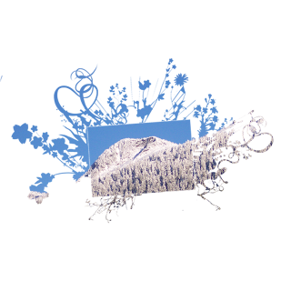
Brag Book Page


I bought some of the most beautiful digi-goodness the other day and had to find something to use it in. So, here goes. Gaye, my new net-friend has just opened her shop and I think she has a great future here in our world. Her blog is http://gslcreations.blogspot.com/


Now that I have made sure you love her as much as I do... it is time to cover my territory. Today is more of a hint than a tutorial. Plus: when I started putting this into words I realized that I had been doing exactly as jewel suggested in the last post. I have covered the area that I want to remove with the piece I am using as a guide placed above it.


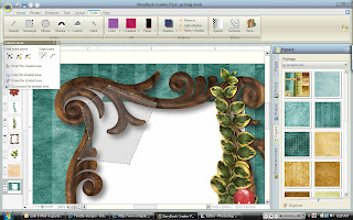
First I need to unlock the paper (by clicking the lock icon in our elements pallette and make it active so that it is the one I am cutting. (I made an initial cut using a rectangle shape cutter that did not extend beyond the outside of my frame. You can always take away, putting it back is not as easy.) Using Jewels hint I will lock my frame. If you are real astute you will notice that my screen shot does not show that. Amazing that I did this before I learned that trick. But, I am not such an old dog that I won't learn new tricks. Another reason I am so glad I have met all you new folks. Maybe we can get more people and have more input. I am having fun. I know, I know, I digress.


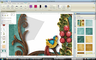
Selecting my custom cutting tool I am placing points along the frame that I know will be covering the empty space.


Now you see the paper underneath that we are trying to get rid of. It is pretty paper but it would get in the way of my picture when I place it underneath. See QP post http://geezee-whoknew.blogspot.com/2009/02/i-am-working-on-using-qp-from.html


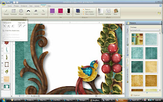
I find that expanding my cutting area into the white space helps me feel like I have some control over the cutting area. When I have made sure I haven't gone too far into the frame or extended into space I don't want taken out, The next step is to erase the shaded area.


See, beautiful detail.
have fun, I will go play in the snow now.
g


Other Perspectives

Dearest Ladies,

I will change my greeting if and when I discover gentlemen that read these posts. Right now I think I only have ladies so that is what I will use this morning. I have had a few minutes to publish comments in the last couple days and I enjoy getting all perspectives in the responses. I am learning new things and enjoy trying new ways of doing stuff. I am glad to have this opportunity to share. Kind of feels like a forum where I get to be in charge. Can you tell I am a control freak? That was only supposed to be a little bit funny. I wanted to share a couple of tips shared by Jewel on a couple of my posts. I find them to have a valid offering of different perspective and I am enjoying trying her hints and tips as well. Also, with me getting them before I allow them to publish, I get to play with them before I share them nah nah nah...

Jewel said:
Another tip - sometimes you can see your image better in black and white to get a cleaner extraction. How I make this work is I duplicate the image, make the top one black and white. I use the properties fields to make sure both images are in the exact spot in terms of left and top inches. Then I lock the black and white one, but keep it on top. I select my colour one on the left (so it is the one I am cutting, but can't see) and I use the black and white one as the guide for where to cut. Then when I am done - deleted the black and white one and the coloured one is there all nicely extracted.

And one more tip - hope you don't mind - a very slight edge blur on your extraction can help with some of those slightly darker edges. I'm talking a 2 or a 3 in the edge blur meter - very slight - but it makes a difference.


I really like this idea of using the black and white version to help cut down on (noise?distraction?). I will be trying this soon when I am again playing instead of trying to accomplish something in the short time I give myself on the computer. If I don't get my tuts up before the 1st weekend in April look for 2 to be posted that weekend after I spend time at a scrapping crop a friend has once a month.

also offered by Jewel,

If I want to use a floral and a grungy and say a torn overlay ... I need
to be able to just pull them onto the page and play with opacity and sometimes I'll even put another colour layer in between them with low opacity too, to add to the brightness.

I had not practiced using more than one overlay with color variations. Honestly, I had not even considered the possibility yet. This artistic stuff is still a bit of a new concept to me. I guess I am still getting used to doing something pretty as opposed to something practical.

I am glad that the questions y'all posted on other sites prompted me to start this blog. I am enjoying. And I feel like I have made new friends. Thanks again for all input. Oh, and just so you know some comments do not get published if there is any personal contact info I will automatically not publish unless the author wishes it. I don't publish my contact information but I do respond personally if needed. I want my place to be safe and being the person that I am I want to share what I want when I want. That will be respected here as well. This will be a safe place as long as I am in charge. Can we all say CONTROL FREAK lol

love,

g

Sunday, March 15, 2009

Winner

Sharon guessed Alaska! Too bad I don't have prizes to give out. I even met the Governor yesterday. I am working on a tut for making brag book pages. Will post whichever I finish first. Masks or brag book "who knows?"

Saturday, March 14, 2009

I am entertaining guesses as to where we are VACATIONING. It's a good thing that the dog living here chooses to stay in the yard. That fence is no help right now. And I think I have got it for the masks. Still mulling it over :)


Friday, March 6, 2009

Traveling Today

Well, all the things I have tried with the masks seem a bit complicated. I am trying to refine it a bit. Of course when I get around to postine an explanation we could lose something in the translation also. lol. I promise some results soon and maybe a giftie if I have to go the route it looks to be going. Oh, well.

On to the travel. We are beginning our month-long trip and since I don't share many personal details here, suffice it to say we will be very busy. Looking forward to taking Me time to get this mask business ironed out and posted. Still welcoming any input I can get.

I am not dropping entirely off the earth, just peeking over the edge a bit.

Tuesday, March 3, 2009

Back to the drawing board

I will now be playing with my masks and pictures for a bit. Looking for a foolproof method in order to make it easiest to predict the end result. All input will be accepted gratefully. I haven't had much problem so I will check into what can make them work with more predictability. I am embarking on a month-long trip this weekend so I may be slow. I do love a challenge though. So I know what I will be doing when I can't sleep at 3am :)

Looking forward to it. I must thrive on puzzles.

Monday, March 2, 2009

Extraction

Ok grab your favorite beverage. We are in for a long one this time. I think it is hilarious that I am learning how to us PSE in order to post my screen shots for blogging tutorials pertaining to SBC+.

Next, I am not all that thrilled with the exactness of my end product. I am somewhat of a perfectionist. You would not be able to tell that from some of my ramblings. So if you want a more perfect example to see, I will do another one when I am not tired, or busy, or preparing for a month-long trip. Sometimes, I just have to get it done. Besides, the precise nature of this is solely up to the artist(that's you, you know).

First, I want to get rid of as much excess as possible by cropping the picture. Then, on my page I make that picture as large as possible. It gets fuzzy sometimes, but that is ok. The larger the pixels are, the easier it is to get rid of the ones you don't want. Once you shrink it down to the size you will be using, the clarity returns. I used a shot I made of the toy we gave my cousin the other day.
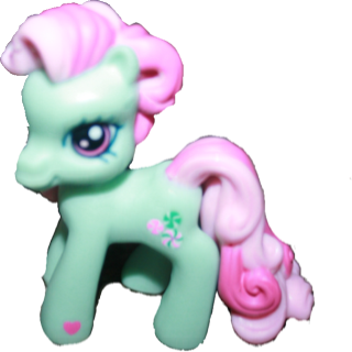

Using cutters on the tools tab there are choices that are fun to play with. I like the ellipse shape. (The more I look at this silly example, the more I can't believe I am really putting this out there as an example of how to do this.) Feel free to call me lame.
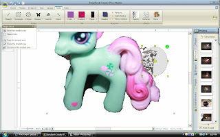
Working with large areas, I use a larger cutter in the closest shape resembling the edge that I want cleaned up. Saving after each cut helps to do small portions and not lose your work by just having taken on to much at once. I have experienced that so I know.


When using Custom cutter the curved edge type helps with smoothing round spots.


Funny looking, I know. If you can see the shaded area it is shaped funny. When following the edge of the figure you are extracting try not to be nervous when the shaded area crosses over itself. This will change when you click outside the figure to complete the area you want shaded. Each time you place the croshairs in a spot and click that creates another reference point to select for cutting purposes. When you need more reference points you can add using the + or take extra points away with the -. I like the one that lets you move an already existing point. A little more or less in case you drifted while clicking. This one has an arrow on either side of the point in the adding points dialog box.
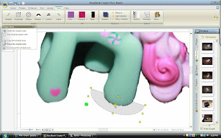


My favorite shape cutter. I can really get it to clean up round edges. Very versatile to stretch so many directions. But you can find your own favorite shape cutter in the drop-down menu.
I have tried to make sense here. I can just imagine what it is going to look like when I check it again tomorrow. I certainly hope you get something from this post. :)


Masks

Guess what? In order to use a mask in Storybook Creator Plus, I use the same method as in my first post. http://geezee-whoknew.blogspot.com/2009/02/hi-i-go-by-geezee-and-follow-digitreats.html

I think that in order to use any picture and take negative space from it using templates, or mask or a shape works well as a paper element. This gives you the options to treat it as a paper. Any edits that you need done to the picture should be performed prior to using it as a paper element. Also, of note, leave plenty of space around the part of the picture desired for your end product. This gives you room to play with your item with more freedom. I use my undo button a LOT. I Love that thing.

Thank You

I am so happy to be working on this project. It seems that everyone has something to add. I love this response from Jewel. In my efforts to keep from using Creative Memories proprietary material, I have left out certain processes. I guess I just need to make a little line to add to all my posts that covers this subject. Thank you for pointing out that we can sample color from anywhere visible on the page. I was unaware of this. I learn something new everyday. Any more questions are invited. I seem to have acquired lots of help. Thank you, everyone. I am still getting to the post about extracting pictures. I want it to look nice so that I look like I know what I am talking about.


Jewel said,
A couple of things I'd add....

I never unlock my background. I always create a square and on the page, and make it the size of the page, and use that as a background. My reason for doing this is that background piece can never be re-sized. For example, if you do a layout in 12 x 12 and decide you actually want to print it at 8 x 8 ... you unlock all your elements and papers, click 'select all' then 'group' and you can resize the whole thing at once to 8 x 8. BUT that background page won't resize. So I have learned (the hard way) just to leave it white, and leave it locked, and build my papers by starting with a square from the shapes menu. Did that make any sense?

Also, you can colour sample from a photo that is not on your page, as long as the photo is showing along the right. You can also colour sample from elements or papers or pages you have already done, as long as they are showing on the right. You can colour sample from anything that is visibile when you click 'sample'


And about adding your overlays to your surfaces file of the program ... I do it a different way. I don't add it to the program files at all (that's scary and makes the program bulky to load) I just add a collection to 'My Stuff' of all my overlays. then I pull them on to the page and play wit opacity, size, shadows, etc. I have gigs and gigs of overlays (I am an overlay addict) and it would seriously slow down my program to put them all in the program file. And finally - I would encourage you to play with the gradient settings on your papers sometimes if you haven't already. You can do a 2 colour gradient, with very slightly different colours, and it just gives your page some dimension (in addition to whatever overlays you are using). And a 2 colour gradient with totally different colours (say, purple and pink) can be quite stunning.